Building a visual style for your blog is not just about choosing a filter. It's the ability to work with color, light, and mood that viewers sense before they even read the caption under a photo.
Color is one of the most powerful tools in visual content. It:
- forms the first emotional impression;
- is associated with topics, feelings, people;
- sets the rhythm of the page and amplifies your personality or brand.
Where to Start? Define the Idea Your Visual Conveys
Before thinking about editing, colors, and templates — ask yourself: "What is my profile about?"
It could be:
- Lightness and coziness? → warm tones, coffee filters, light
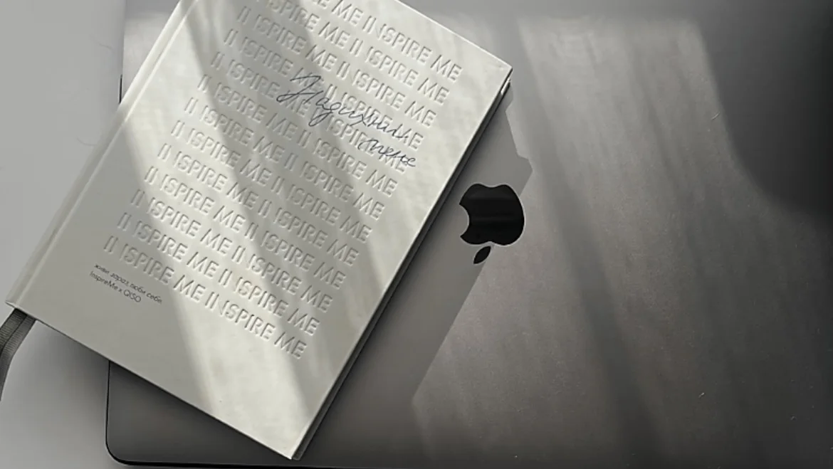
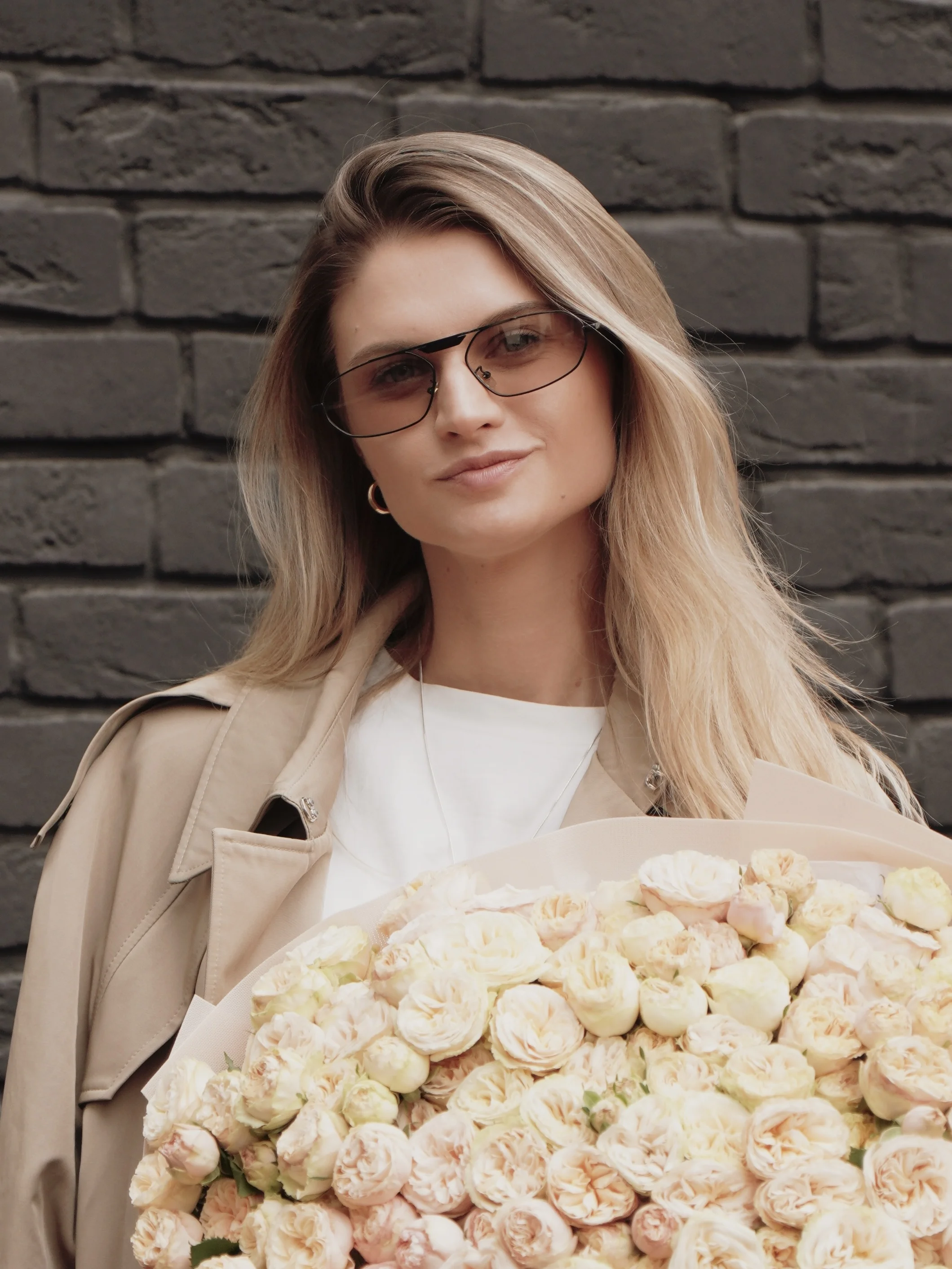
- Luxury and professionalism? → muted shades, black, beige, powder
- Depth and creativity? → contrasts, cool tones, lots of space
- Minimalism and balance? → pastels, light backgrounds, monochrome
- More life? → bright accents, natural colors, movement
Colors "work" even when we're not aware of why we're drawn to a particular profile.
Choosing Your Visual "Temperature"
One of the simplest ways to define your style is to understand which color "temperature" is closer to you.
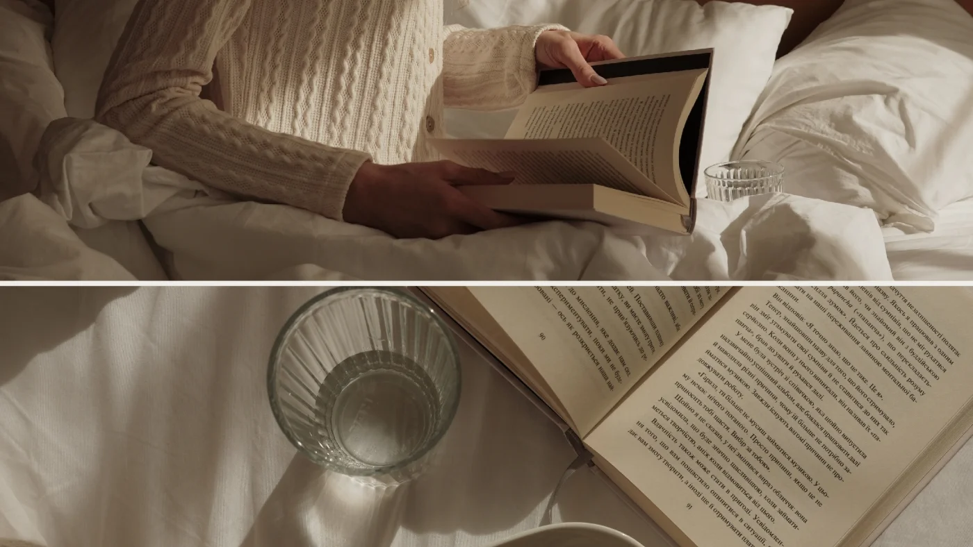
Warm tones:
- suitable for personal blogs, travel content, food photos
- evoke trust, warmth, coziness
- associated with homeliness, sincerity, personal moments
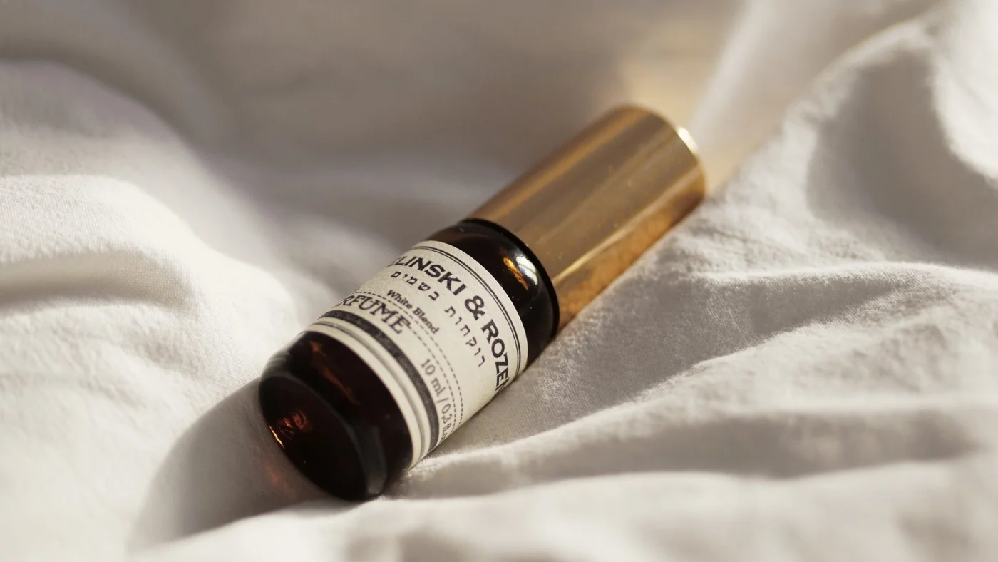
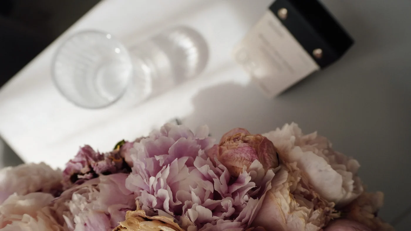
Pastel and nude:
- suit fashion projects, lingerie brands, beauty content
- create a feminine, tender, and soft atmosphere
- pair beautifully with simple backgrounds and air in the frame
Cool colors:
- great choice for interiors, digital content, art
- give cleanliness, strictness, a sense of space
- draw attention to details and composition
Don't be afraid to mix. A blend of warm and cool = depth and visual complexity.
How to Create a Palette for Your Blog?
You don't need a design education — visual intuition and consistency are enough. Here's a simple plan:
- Choose 2–3 main colors. One for the backdrop or background (main color in photos), another for accents, third as a support or neutral.
- Create a moodboard from references on Pinterest or saved posts.
- Make a test grid: 9–12 photos in one palette.
- Analyze:
- What works?
- Where is there a sense of harmony?
- Which photos "stand out" — and why?
- Write down the emotions the feed evokes. That's the foundation of your style.
🔍 If you want to better understand how to work with composition, light, and framing at home — be sure to read our guide "How to Take Beautiful Photos at Home with Your Smartphone".
Practice = Style
You won't find your visual from the first try. It's about experimentation, flexibility, and analysis.
Every new experiment (new filter, color, angle) is one more step toward a recognizable, cohesive page. Style is not a set of effects. It's a reflection of you + the choices you make consciously.
MULI Helps Not Just Edit, but Build a Color System
Filters in MULI are not just effects. They're tools that help:
- keep the palette stable
- experiment within one style
- feel the difference between "warm" and "cool"
- find your visual formula
Want to better understand how color works in the frame — open MULI, choose a filter, and play with the palette. Intuition won't let you down.
More on which filters are trending right now — in our separate article "Trending Filters in 2025: Colors, Styles, Examples". There you'll find recommendations depending on the type of content.
Conclusion
In 2025, visual content is no longer about "turned out / didn't turn out". It's about intention, style, and impact. And if your blog is you, then your color palette is your voice without words.
Find your tone.
And let it sound beautiful 🤎